


Anchored Adaptive Banners.
.The importance of adaptive banner ads is growing day by day. Adaptive banners are the next generation of responsive ads, maximizing performance by optimizing ad size for each device. Improving on smart banners, which only supported fixed heights, adaptive banners let developers specify the ad-width and use this to determine the optimal ad size.
To pick the best ad size, adaptive banners use fixed aspect ratios instead of fixed heights. This results in banner ads that occupy a more consistent portion of the screen across devices and provide opportunities for improved performance.
Constant Size Return
Adaptive banner ads constant size. When working with adaptive banners, note that these will always return a constant size for a given device and width. Once you’ve tested your layout on a given device, you can be sure that the ad size will not change. However, the size of the banner creative may change across different devices. Consequently, it is recommended to ensure your layout can accommodate variances in ad height. In rare cases, the full adaptive size may not be filled and a standard size creative will be centered in this slot instead.
When to use Adaptive Banners
Adaptive banners are designed to be a drop-in replacement for the industry standard 320×50 banner size, as well as the smart banner format they supersede.
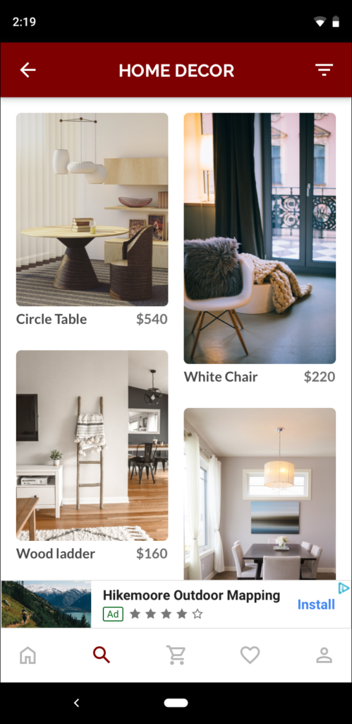
These banner sizes are commonly used as anchored banners, which are usually locked to the top or bottom of the screen. For such anchored banners, the aspect ratio when using adaptive banners will be similar to that of a standard 320×50 ad, as can be seen in these screenshots:
How Adaptive Banner Utilizes the Screen Size?
An adaptive banner makes better use of the available screen size. Additionally, compared to a smart banner, an adaptive banner is a better choice because:
- It uses a provided width rather than full screen width, enabling you to account for display cutouts .
- It selects an optimal height for the specific device, rather than having a constant height across different sized devices, mitigating the effects of device fragmentation.
Adaptive Banner Implementation Guidelines
When implementing adaptive banners in your app, keep the following points in mind:
- You must know the width of the view that the ad will be placed in. And this should take into account the device width and any display cutouts that are applicable.
- Ensure that your ad view background is opaque to be compliant with AdMob policies. This is to ensure when smaller ad sizes are served that do not fill the ad slot.
- Ensure you are using the latest version of the Google Mobile Ads SDK. For mediation, use the latest version mediation adapters.
- The adaptive banner sizes are designed to work best when using the full available width. In most cases, this will be the full width of the screen of the device in use. Be sure to take into account applicable display cutouts.
- The Google Mobile Ads SDK returns an optimized ad height for the given width in an
AdSize. - There are three methods to get an ad size for adaptive banners. One for landscape, one for portrait, and one for the current orientation at the time of execution. For more information, see the full API documentation below.
- The size returned for a given width on a given device will always be the same. Hence, once you’ve tested your layout on a given device, you can be sure that the ad size will not change.
- Anchored banner height is never larger than 15% of the device’s height and never smaller than 50 dp.